


Seven Years Golden (1997) & Piece of Cake (1992), Pt. II
If anyone hoped that a revolution could actually succeed, the event of the late 1968, crushed their dream beneath the boot of repression - Art Chantry


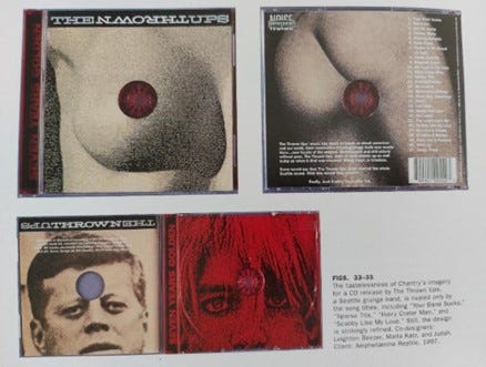
CD release for The Thrown Ups-Seven Years Golden (1997), designed by Art Chantry. Co-designed by Leighton Beezer, Marla Katz and Judah
(Lasky, 2001, p.116).
Read Part I here.
The Kennedys are important figures for Art Chantry. He recalls that the assassination of John F. Kennedy`s brother Robert F. Kennedy (who had won the California presidential primary) on 6th June 1968 was even more significant than the assassination of John F. Kennedy.
The ‘’assassination of Robert F. Kennedy was the end of the world. (In retrospect it is more pivotal than JFK’s death, because that was the moment everybody gave up and bought a gun)…
It’s the first time I realised there was truly no future’’ (Lasky, 2001, p.31).
Chantry positions John and Robert Kennedy as symbols of the future, specifically, positioning the Democratic party as the future of the United States. He further explains that ‘’If anyone hoped that a revolution could actually succeed, the event of the late 1968, crushed their dream beneath the boot of repression’’ (Lasky, 2001, p.32). With this quote, Chantry highlights the Kennedy`s as revolutionists. He infers that repression had won in America and politics after Kennedy, were repressive. Therefore, when considering Chantry`s protest against Republican president Ronald Reagan, it is a protest against the political party and ideology which he deems as the end of the world. Considering how Chantry believed that the assassinations of the Kennedy`s were the end of the world, the comparison of Kurt Cobain to John F. Kennedy, suggests that he feels the same about the death of Kurt Cobain.
One cannot ignore the composition of the shot for the design of the CD, it is lined central with the teeth of the hub, serving as a metaphor for a target. It is placed in the centre of the forehead and between the eyes for both Kennedy’s and Cobain's portraits. In such composition, Chantry draws similarities between the assassination of John F. Kennedy and suicide of Kurt Cobain in 1994.
Even The Time magazine compared the coverage of Cobain’s death to the 1963 assassination of President of John F. Kennedy (McDoughall, 2013,p. 89). The unified composition, suggests that both have been targeted. Considering the mentioned media exposure that Kennedy received and the idolatry of Cobain in the media, this is symbolic of such attention being deadly. This is supported by the red colour used, which on simple terms infers blood and death [vampiric as Bela Lugosi]. Whilst at the same time, when considering the black and red colour scheme, it is establishing a hardcore punk influence [which even looks soo kool].
The red colour in this design is heavier and on the burgundy side, just like the colour of red in the exemplified Ray Gun cover of Henry Rollins [Click Here :)]. It mimics blood, which reminds the spectator of the human element behind the ‘cult’ celebrities. The imagery becomes violent and disturbing in terms of its framing, the spectator becomes confronted with the direct eye contact from the portraits. Creating vulnerability and loss of dominance/power as they are targeted.
Both portraits feature soft facial expressions, focusing on the eyes to guide the spectator to identify their emotions. This creates a powerful design, allowing to showcase the lack of power any human beings have over death, regardless of their status. Considering their political influence worldwide, and musical influence these figures contained, this factor becomes blurred, as celebrities in the media are admired and seen with a higher power relation. The implied power from these images draws the feelings of guilt from the audience, creating a sense of responsibility for the figure’s deaths.
It is dismantling as mentioned before a sense of hierarchy between the two cult figures. Chantry is proposing that anyone can become as influential as the former President of the United States. Both portraits infer a bullet target, which furthermore, dismantles the hierarchy of power, both are shown to be equal. And both have died by a gun shot. Chantry is establishing a middle-class musician without a ‘strong’ educational background (Kurt Cobain) as powerful as President Kennedy, promoting the idea of the American Dream of one becoming whoever they wish to be and the United States of America being the land of opportunity.
Critic Julie Lasky describes the design cover as tasteless (Lasky, 2001, p. 116) based on the female body images chosen, yet remarks that the design is ‘’strikingly refined’’ (Lasky, 2001, p. 116). When considering the female figure and displayed body parts such as the breast; they are symbols of fertility and birth. Suggesting that both individuals are born in the same way (from a woman) and have died in the same manner by a gun (with the gun target mark between the eyes of both subjects). Again, establishing the lack of boundaries or power between both figures. There is no difference. Yet at the same time, such photography connotes ‘sex sells’ ideology to promote capitalism and provoke the audience. This is further enhanced by the record featuring song titles such as ‘’Sparse Tits’’(1996), in such a way that the design is reflective of the music. But as critic Julie Lasky had observed about the record being tasteless, this has been achieved also through the DIY aesthetic, by the use of high grain, pixelation and low-resolution print & aesthetic.
In combination with the mentioned pixelation, sexualised female body photography and the mentioned song title; such album becomes provocative. It is using sexualised photography in the same context of President Kennedy, Kurt Cobain and death. This combination is challenging conservative values and society's morals. However, the use of grain, pixelation and low-resolution continues the idea of neo-luddism by the lack of ‘technological sophistication’. The black and white photography resembles material from a newspaper. And considering Chantry`s poster designs (as discussed in Origins Of Grunge Design : Art Chantry Pt. I) this indicates his practice of recycling and re-working.

CD/LP/longbox cover design for Mudhoney’s Piece of Cake (1992), designed by Art Chantry. With Edwin Fotherinham’s utilized blotted line technique, inspired by Andy Warhol and Ben Shahn. Released on Reprise Records (Lasky,2001, pp.88.,89)
Chantry’s work for Sub Pop’s release of Mudhoney’s Piece Of Cake (1992)- the cover of the CD’s longbox indicates how ideas of neo-luddism and recycling have been reworked. This has been done through intertextuality of The Birth of Venus (c. 1484–1486) by Sandro Botticelli. The silhouette from one of the most famous paintings in the world, features Roman mythology Goddess Venus representing beauty and love arriving to earth. In the original artwork the Goddess is holding her hair in her lower-positioned hand. However, in Chantry’s work the Goddess is holding a cut cake, referring to the title of the album. This is confrontational considering Chantry is re-making such respected artwork through comical motifs, creating a parody of the artwork. The fusing of digital art (CD) with Renaissance art references, further, connotes luddite ideologies, as it is referencing the past as a symbol of lack of technology, referencing 1990s luddites concern over the abuse of modern technology. Nirvana`s album In Utero (1993) features a central framed design of a woman’s body, whilst the back of the CD is a collage consisting of human foetus, body parts, bones and lilies, and orchids created by Cobain himself. Which showcase the presence of death even from the chosen type of flowers. In an essence, the record leads the listener to the end- death.
He described it as a still life ‘’sex and woman In Utero and vaginas and birth and death’’ (Gaar, 2006,p.83). Themes of death and birth are also identified in the previously discussed example of Seven Years Golden (1997), both designs use the female figure to infer such. Significantly, Piece of Cake and In Utero both use symbols of mythology. If Piece of Cake references Roman Goddess Venus, Nirvana's album in the ‘thank you’ credits lists ‘’The Goddess Demeter’’ (Gaar, 2006,p.85). In Greek mythology Demeter is the goddess of harvest and agriculture, and sustained fertility of the earth. In Utero with the female body is similar to Botticelli`s painting of Venus, in such an aspect of feminism can be identified. Grunge had supported the Riot Grrrl movement, which combined feminism with punk music and originated from Seattle, simultaneously, with grunge. Courtney Love from Hole was one of the most prominent figures from the Riot Grrrl movement, however, she is also one of the most prominent figures in the grunge movement with her band Hole.
However, such messages have been revoked in Chantry`s work through an illustrative style, featuring a stencil, stamp sketch style with imagery of string light bulbs, contributing to the anti-technology atmosphere and a sense of minimalism. Considering Raymond Pettibon`s illustrative style and the importance of the hardcore punk subculture element in Chantry’s work, the illustrative design of Piece Of Cake (1992) reflects the influence of hardcore punk. The lack of photography of the band does not position the musicians as the selling points, which captures hardcore punk`s fear of selling out.
Poneman and Pavitt have been criticised of limiting their artists when it came to the presentation of their work, even telling ‘’what songs to record, what the album cover would be, and even the title'’(Lenegan, 2020, p.41) of the record, as Kurt Cobain recalled. This had become an issue which had made Kurt Cobain leave Sub Pop. Such control over their artist visual presentation suggests how important unification of Sub Pop artists and Art Chantry`s designs were for the survival, and popularisation of the label as a brand.
Even more significant, is the fact that Sub Pop had tried to use the same 1980s pop culture standard (central, close-up portrait of the artists as an album cover), which Art Chantry had criticised. Mark Lanegan`s solo record The Winding Sheet (1990) caused a dispute between Poneman and Lanegan, as against his will, the close-up portrait taken by Charles Peterson was used as the artwork. A choice that Lanegan deemed as ‘’PRETENTIOUS’’ (Lenegan, 2020, p.53). And such a negative attitude towards the use of centralised portraits of the artists for their album artwork can be identified throughout the Seattle musicians. This design choice is practically non-existent in grung album design. Such choice indicated Sub Pop`s desire to capitalise on Lanegan as a brand, as he would become successful in his solo career and would reach greater sales with this record than with his Screaming Trees albums Clairvoyance (1986) or Buzz Factory (1989). Therefore, indicating the importance for celebrity status for Sub Pop, yet such strategy had been dismantled after this record.
The negative and ‘pretentious’ stigma of such design originates from 80s rock albums, exemplified by the 80s popular rock band KISS, who`s most albums use such strategy. For example, Creatures Of The Night (1982) and Lick It Up (1983) all use portraits of the band. And when considering the hardcore punk movement and Pettibon`s designs, for bands like Screaming Trees and Mark Lanegan who had been signed with SST, such choice would discredit them from being associated with the movement. In contrary, being placed in the ‘selling out’ category which the hardcore punk movement fanatically and obsessively agitates against. Therefore, as Pettibon`s design (as discussed in Art and Design of Raymond Pettibon) reveal, the use of portrait photography of the musicians were not considered cool or fashionable in the hardcore punk scene, which extended to the Seattle scene and grunge
Returning back to the significance of the illustrative style for Seattle, Larry Reid explains that ‘’Seattle became a comic-book Mecca. And it already had roots in that with a number of cartoonists. You know, it became really significant after Fantagraphics moved here; Seattle became a magnet. Julie Doucet, all these cartoonists were moving to Seattle. And it was a direct result of Fangaraphics being established here, its association with the music and graphic milieu, and it was fairly phenomenal at that point’’ (Spurgeon and Dean, 2016.p.322-323). Fantagraphics published alternative comics, novels and magazines. In 1989, they moved from Los Angeles to Seattle, Washington, however it was founded in 1976, College Park, Maryland.
Comic illustrations helped to enhance the hardcore punk scenes protest essence, which Chantry`s exemplified design achieves. For example, Sandro Botticelli's work has been praised by art critics and become a symbol of high class art, traditional bourgeois art. Just like in the design for Seven Years Golden (1997), where sexual photography has been combined with the Former President of the United States and death, this contrast has been continues in Piece Of Cake. This contrast is between Sandro Botticeli`s Venus and the sketch of a urinal and one of the pieces of the cake, which Venus holds, being denoted in the urinal. Chantry in such compares high class art with urinal imagery, considering comic illustration protest element, Chantry`s design protests against high class culture. This is similar to the controversial Marcel Duchamp's Fountain (1917) which marked a change in modern art, where spectators and critics were left questioning if such work should be considered ‘art’ at all. Marcel Duchamp was associated with the Dada movement and this example further demonstrates Chantry`s Dadaist influence.
Reading daily exercises the brain, improves sleep and reduces stress, so why not read some more?! Check this out:
Origins Of Grunge Design : Art Chantry Pt. I

‘’Grunge isn’t even a style: it’s a marketing term coined by Sub Pop’s Bruce Pavitt to sell punk music’’ - Art Chantry.Thanks for reading Grunge Included! Subscribe for free to receive new posts and support my work.