Art and Design of Raymond Pettibon
Neo-Luddism, Reaganomics & Sub Pop: Rejection of comic book narration and depiction of counterculture.
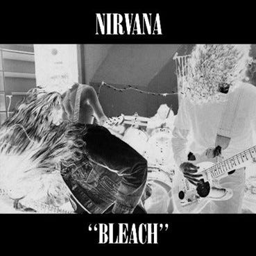
Nirvana Bleach (1989), released on Sub Pop records. Designed by Lisa Orth.
(Sub Pop, n.d.)
According to Bruce Pavitt, the live show element was significant for Sub Pop`s aesthetic. Pavitt and Jonathan Poneman (founders of Sub Pop) prioritised bands that were ‘’compelling in a live setting, and they wanted their records to convey something of the power of a strong live performance’’ (Waksman, 2009,p.249).
To achieve the live show aesthetic on their album covers, Seattle DIY photographer Charles Peterson was hired by Sub Pop. In order to capture the live show aesthetic, Peterson ‘’achieved such proximity with the performers he photographed by staking out his place in the crowd, mixing it up with those in the audience rather than standing apart. Doing so, he portrayed what Pavitt called ‘’the essence of an indie rock show-which is very different from arena rock photography’’ (Waksman, 2009,p.249). The distinctive style of Peterson’s mono-chrome photography is associated with the DIY attitude, which allowed to maintain cheaper production values (as B&W was available more freely); and often lacks clarity of the subjects [which made it look totally more cool !!!].
Such is achieved through distressed overlays, heavy grain, slow shutter speed and lack of depth of field photography in negative. The black and white photography is associated in the music scene as photojournalism. The lack of editorial involvement [creating the concept, studio] creates a sense of factual credibility, suggesting, trust. Which captured the authenticity of the music, the relationship between the fans (society) towards grunge and music as a whole. This also steers away from high production values regarding the clarity, focus and concern of the objects within the frame. From this alone, the intentional neglect of commercial conventions allowed Sub Pop to establish their own marketing strategy, anti-commercial aesthetic. This will be discussed in the following posts.
Just as Pavitt noted, such choices capture a live rock show in motion, crafting a compelling setting and ‘’not only liveness as such, but a certain conception of live rock became central to the iconography of Sub Pop. The preferred setting was a club rather than an arena; the boundary between star and audience was meant to appear fluid rather than starkly defined’’ (Waksman, 2009,pp.249-250). And this is the key element of grunge, specifically, to craft a rock star which appears ordinary, human and pure. The sense of purity is achieved by the accent on the live show element, giving the impression that the band and Sub Pop only care about the music, and have not manipulated the photograph to create a false reality. The photography prioritises the essence of the live show and movement instead of the musicians as individualities. Such high contrast photographs with the photograph itself hiding the subjects faces, not framed central or in the frame itself, does not promote consumerism. As it is not relying on the musician recognition as a selling point. Importantly, as the band had not gathered mainstream prominence at the time of this album, the recognition of individual faces would allow to create a more effective advertisement and individuality.
Sub Pop ‘’appropriated a live rock ideal that had taken root through the influence of punk and used it to transmit a coveted sense of intimacy, intensity, and community, all of which came to represent the Seattle Sound as constructed through the label`s products (Waksman, 2009,p.250). This was continued across the label, Sub Pop designs are mirrored and unified across the signed bands. Creating a brand/label image, rather than focusing on the band as individuality. This ultimately crafts the scene’s aesthetic and values. The unification aesthetically of all of their artists makes the grunge scene easier to appropriate and capitalise on. If one needs to achieve the grunge look, by looking at Sub Pop`s aesthetic all the conventions are laid out. The lack of distinction between bands and musicians makes it easier to commercialise on, which Sub Pop had achieved. Whilst the Seattle`s record label had progressed the importance of anti-consumerism throughout their brand identity, they had capitalised on anti-consumerism as a fashionable attribute.
Notably, Nirvana`s album Bleach (1989) is an anti-commercial choice designed by Lisa Orth. Jane Higgins (Art Designer for Sub Pop) explained that Sub Pop desired to create a package and identity of raw, not-over-produced design and aesthetics (KEXP, 2018). Mimicking the design and approach of Raymond Pettibon and SST label which had signed popular hardcore punk bands of the 1980s. Kurt Cobain had wanted to become a signed musician on the SST label in which Pettibon created all album covers for. The label was established by Black Flag`s guitarist and Pettibon`s brother Greg Ginn in 1978. Seattle musician and Screaming Trees frontman Mark Lanegan explains about SST, that:
‘’they allowed their artists to do whatever they wanted. SST had never asked to hear anything or see any artwork until we gave it to them and Kurt’s experience with Sub Pop had been the polar opposite. They told him what songs to record, what the album cover would be, and even the title of his record’’ (Lanegan, 2020,pp.40-41).
Lanegan indicates that Sub Pop was aesthetically oppressing and aesthetics were important for the label. [Just as a note: Mark Lanegan Sing Backwards and Weep: A Memoir (2020), is a must read for grunge fans. Even for someone who is interested in people and personalities, because he was one-hell-of a musician. True emotional roller-coaster from the feelings of embarrassment, disgust, laughter and shock- You will dig it].
Considering the success of grunge, Sub Pop is the primary source and one of the most important sources of grunge design. However, considering Nirvana`s desire to leave Sub Pop and their appreciation of hardcore punk band Black Flag, it is worth discussing Raymond Pettibon`s work at SST. Specifically, it is important to do so in order to establish the influence of SST on Sub Pop; influence of Raymond Pettibon`s work on grunge design and the political ideology.
Raymond Pettibon designed CD, vinyl, cassette, and poster artwork for bands such as Black Flag, Minutemen and Meat Puppets, which had expressed their rage against the 1980s Ronald Reagan`s administration and presidency. Seattle bands have acknowledged Minor Threat, Black Flag and Dead Kennedys as great influence, supporting their political messages, which had been greatly displayed in the hardcore punk visual products. Raymond Pettibon`s illustrative style of the Ashcan school which was concerned with the depiction of the daily life of the urban, financially suffering neighbourhoods; enhances the working class thematic to his work and SST, lacking technological sophistication or involvement.
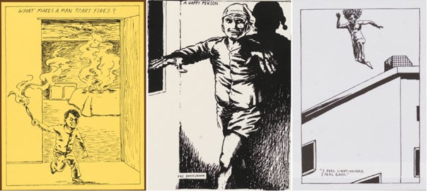
Designer and author Ian Lowey and Suzy Prince have agreed that Raymond Pettibon ‘’is arguably the one who has found greatest favour within the fine art world’’ (Lowey and Prince, 2014,p.147). For the reason that Pettibon was bestowed with the Bucksbaum Award by the New York Whitney museum of American Art in 2004, worth $100,000 (Lowey and Prince, 2014,p.147). Such award is the largest award for an individual artist ‘’and is given biannually to an artists ‘who possesses the potential to have lasting impact on the history of American art’’(Lowey and Prince, 2014,p.147). By the 1980s Raymond Pettibon had settled on his trademark form of expression ‘’a black and white single-frame drawing, mixed with words-often just a single sentence’’ (Mattson, 2020,p. 21). As seen through the exemplified artworks for Minutemen`s LP`s What Makes a Man Start Fires? (1983), Howl Under the Influence of Heat (1983), Double Nickels on the Dime (1984)
Artworks by Raymond Pettibon for Minutemen LP as follows: What Makes a Man Start Fires? (1983), Howl Under the Influence of Heat (1983), Double Nickels on the Dime (1984), (Pettibon, 2020).
The exemplified designs are high in contrast, portraying subjects in movement. They display a harsh, brutal, and unfinished aesthetic, promoting the DIY mentality, as it lacks technical sophistication- in terms of computerised, digital design aesthetic. This is identifiable likewise in the mentioned Bleach (1989) example. These designs use texture, brush strokes and hand-drawn design in a sequential art style. Featuring lettering, comic book narration, comic strip style drawings, reflective of DIY values, when considering the lack of technological dependence [you are free to decide whether it is more laborious or not]. Symbolising a protest against technology, which we will discuss further into the blog.
The anti-consumerist idea is achieved through not displaying the photo of the artist, similarly like Sub Pop had done. Sub Pop preferred to craft the boundary between the star and audience as fluid, meaning, that the star is equalised to the spectator. There is no superiority of the star or spectator. Pettibon`s work enforces this message even further, as he used his own, DIY artwork instead of photography of the performers. The spectator is guided to focus on the artwork and the music instead of the performers faces as brands. In such way not relying on the celebrity’s status as the selling point. Yet, the brisk and rough illustration style prioritises expression over precision, accenting the punk atmosphere of such work. Kevin Mattson remarks that Pettibon:
‘’had rejected comic book narration (the sort that punk magazine used), seeing it as too safe and formulaic. Instead settling on his style which become metaphoric, as: ‘’a single image and text would prompt the viewers to question their own logic. Viewers were supposed to fill out their own meaning’’(Mattson, 2020, p.21).
However, despite rejecting the comic book narration, it is important to note that comic elements are present within his work. Ian Lowey and Suzy Prince (2014), explain that the spirit of punk in musical and comic form were ‘’embraced by the 1960s underground comix pioneers such as Robert Crumb and Robert Williams, who saw it as offering a continuation of at least some of the spirit of nihilistic excess and anti-authoritarian attitude that had previously found expression in the underground comix’’ (Lowey and Prince, 2014,p.153). Meaning that comic illustrations helped to enhance the protest element in hardcore punk and enforce its political messages (such as anti-republicanism, anti-consumerism and the need to think). This is a trend across hardcore punk, specifically, in music. The same necessity for the viewer to think was accented behind the SST Records hardcore punk band Minutemen, who were ‘’the thinking listeners and thinking musicians’ hardcore band’’ (Mattson, 2020, p.20). Minutemen were a politically driven band, similarly, like SST artists they criticised Republican politics. Most notably, through songs addressing Republican figures, such as the former U.S Senator of Wisconsin in ‘’Joe McCarthy`s Ghost’’ (1985). The D.C fanzine Truly Needy highlighted that such ‘’songs make you think, not feel’’ (Mattson, 2020, p.191). The accent to make the spectator or listener think, makes Pettibon`s work open to interpretation. However, Pettibon uses American cultural iconography and political iconography frequently, protesting and reflecting on political and cultural moments.
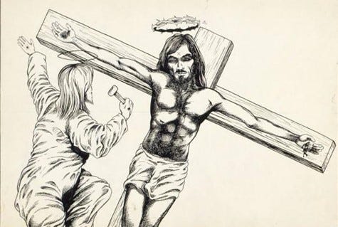
Not Tittle (Jesus), (1979) by Raymond Pettibon (Hauser & Wirth Collection, 1979).
Pettibon was ‘’depicting the sick and twisted element of the counterculture, but also its apolitical side’’ (Mattson, 2020, p.23). Notably by displaying figures such as the criminal Charles Manson who had advertised the Hippie counterculture in the 1960s, Pettibon portrays him in a critical and satirical manner. Hippie culture had celebrated freedom of expression and identity, through protests and musical festivals such as Woodstock. Challenging gender stereotypes through fashion, especially, through men growing long hair, which would be perceived as feminine from conservative Americans. Yet, the ‘take it easy’ mentality which had dominated the Hippie movement, had become an apolitical and self-indulgent approach, when considering the encouraged and stylized drug culture aspect to the movement. No Tittle (Jesus), (1979), illustrates the cult leader Charles Manson being put on a cross, referencing the biblical story of Jesus.
Inferring how much power and influence Manson had held over his followers. As well as his self-proclamation of being Jesus, God and Satan himself. And such proclamations from Manson’s side are revealed as dangerous in Pettibon`s work, as the culture of the 1960s and counterculture had allowed Manson to grow in popularity within his followers. The placement of Manson on a cross with his hand being nailed to it, infers that a cult criminal has the same status and following as Jesus, who as a biblical figure represents innocence and purity. Attention should be brought to the subject on the left, specifically, subject's hands which appear to have nail marks. Inferring that they had been nailed to the cross themselves. As if Jesus himself is swapping places with Manson. Likewise, the figure with the halo could be referencing Manson`s followers. The Christian iconography used in the story of Charles Manson, criticises religion. The artwork in this case infers that religion is man-made and a man proclaimed cult. Anyone can become Jesus Christ as Manson`s proclamation and Pettibon`s work suggests. Yet, Pettibon makes it clear that Manson will never reach such adoration as Jesus, as the slanted composition of the cross infers devilism and instability. This is captured through the artwork portraying a movement, specifically, one subject reaching for Manson, whilst Manson is tilted to the left-bound to fall.
The idea that Manson is bound to fall, also infers the dangerous nature of cult leaders, as he will fall back on land and he will be free on earth. Failure not only has been inferred about Manson, but the counterculture movement, as it had glamorised and idolised a criminal. Even the fact that Pettibon takes the courage to place Manson in a biblical iconography of Jesus is controversial and offensive for some, significant for the American underground protest when considering the large population of Christian Americans. Pettibon`s political activism and criticism is important to highlight as the Seattle movement who originates from hardcore punk, had become a mainstream phenomenon in the 90s and expressed similar values. Elements of Pettibon`s work had been incorporated into the grunge movement, meaning that grunge was a form of punk.
Pettibon had established and confirmed that in order to be recognised as punk, political activism needs to be present. Grunge`s like towards such mentality and hardcore punk is identified not only through grunge musicians favouring such musicians, but through Soundgarden and The Screaming Trees being signed on SST. This means that they had become a part of such mentality and hardcore punk. When considering the fact that Kurt Cobain had desired to be signed under SST, it indicates the importance of SST on the development of the grunge movement. Placing them as the figures that they aspired to be, at least to be part of the collective. Including design, as Pettibon had created the aesthetic for SST. Even more significant is the fact that Pettibon is relevant in the present punk and rock genres, and has continued to create designs for artists such as
Foo Fighters (on their album One by One in 2002), who`s lead singer Dave Grohl [as everyone might know] is the drummer of the grunge band Nirvana. This indicates that Pettibon`s influence and the respect, appreciation he received from grunge musicians has not disappeared.
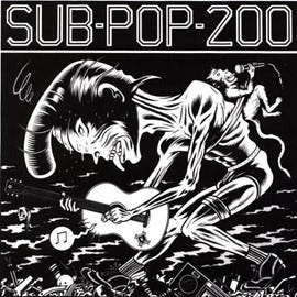
Artwork for cover of SUB POP 200 in 1988 compilation record by Sup Pop records, (Sub Pop, u.d)
Artwork for cover of The Blasting Concept (1983) compilation record for SST Records by Raymond Pettibon, (Discogs, n.d.).
Sub Pop had been influenced by SST, especially in graphic design. Charles Burn`s artwork for the Sub Pop 200 (1998) compilation uses a caricature style artwork, exaggerating facial features. It displays a DIY design aesthetic, resembling the work of The Blasting Concept (1983) compilation by Raymond Pettibon for SST . Notably, both graphic design works use black and white, high contrast characters with exaggerated facial expressions, conveying expressive power and aggression. Whilst, both examples visualise an act in motion, the frame chosen for the covers represent the climax of the action, resulting in intense and grotesque artworks. As Lowey and Price had noted, the use of caricature and comic book style is a form of protest. Specifically, against technology and corporatism that is attached to it.
This is a reflection of the rise of Neo-Luddites in the early 1990s, originating from the '’British labour movement that resisted the rise of factory system by attempting to destroy industrial machines''(Friedman, 2005. P.182). Neo-luddites of the 90s were not protesting the use of all technology but were concerned ’’with resisting exploitative uses of technology’’ (Friedman, 2005. p.183). Such is a common theme through the poster art of Art Chantry (which will be discussed in the following blog posts), as he has ‘’resisted the use of digital technology, which number of designers feel has led to repetitive, homogeneous graphics in the recent years’’ (Reyes, 2000, p.374). In such, protesting also against consumerism. Both Pettibon`s and Burn`s artworks infer neo-luddism and showcase how such ideas were present in the 1980s. Sub Pop reflecting the Seattle underground and SST reflecting Long Beach, California underground, showcases that such ideas were widespread across the United States. This is one of the external factors which had contributed to the success of grunge in the 1990s. With this said, such design with neo-luddite elements protests against 1980s futurism, which used computerised layouts, often became monotonous. The neo-luddite aspect is reflective of American culture and society` fears as a study supported by Dell Computers in 1994, illustrates that ‘’55% of Americans suffer from technophobia’’ (Szewczak and Snodgrass, 2002. p.212). Serving as criticism of the rise of technology in the 1990s.
The Blasting Concept (1983) as the name suggests with the nuclear-mushroom cloud denoted in the distance, conveys the Cold War (1947-1991) between the United States and Soviet Union. The cold war relations had intensified resulting in a nuclear arms race between the powers. In 1979 relations had reached a higher intensity, by the Soviet invasion of Afghanistan. This resulted in greater hostility and both superpowers continued to grow their military weapon arsenal. Ronald Reagan in 1984 had proposed the Strategic Defence Initiative (SDI) which became known as the Star Wars Program due to the aspiration for the program to have a system which would detect and deflect any nuclear weapons towards the United States by x-ray laser in space. Whilst the program proved to be too expensive to come to realisation, this marked how intensive the Cold War relations had become. And such program suggested that American society should expect nuclear weapons from the Soviet Union. Likewise new technological advancements had caused technophobia, as audiences previously not exposed to much technology were introduced to the Nintendo Entertainment System and Gameboy, Sony Walkman TPS-L2, also Apple Macintosh, which became the first all in one-mass market computer to include a mouse, built in screen and graphical interface in 1984. Not only did the film industry embrace the optimism of futurism through science fiction films of the 1980s such as Blade Runner (1982) and The Terminator (1982) but graphic design embraced it too.
When it comes to the graphic design world of the 80s, one of the design genres which heavily persisted throughout the 80s was Neon Noir. Extending to tropical, futuristic designs and the Memphis-Milano style, with bold colour palettes and geometric shapes. As well as, the display of sports cars and women, showcasing, the desire for a glamorous lifestyle; encouraging the lower ranks of the American society to aspire to obtain such ideals. Enhancing the luxurious pop culture lifestyle as well as computer based graphic text and grids. With influential artists such as Erik Nitsche and April Greiman who embraced computer and design integration. All this aimed to capture optimism of the decade, which can be attributed to the growing celebration of wealth, as suggested by President Ronald Reagan’s ‘Reaganomics’, as in ‘’the 1980s, 100,000 Americans became millionaires every year. The average annual earnings of the bottom 20 percent, however, fell from $9,376 to $8,800’’(Digital History, 2016). Notably, as the wealthier the American society became-more disposable income; decreased stress regarding financial difficulties, generating stability and positivism. Resulting in the designs to capture a wealth, success, and victorious aspects, differing from the American Cold War (1947-1991) opponent- the USSR, which stagnated financially.
In such, the advertisement of futurism, the display of wealth and optimism worked as the affirmation of supremacy of the United States, as the Soviets economically were troubled. Such fanaticism of futurism and its integration across graphic design took the audience’s attention away from the tragic events of the 70s. Such as the controversial Vietnam War (1955-1975), in the United States resulting in ‘’over 58,000 killed, 300,000 wounded and 2,000 missing in action’’ (Bitner, 2007,p.17). Or the intensification of the Cold War in the 80s. This aspect was protested by hardcore punk and Pettibon included.
By the end of 80s, with acid music genres growing popularity, a new design style became popular. Characterised by bold, blocky typography ‘’designed as such so that it could be legible and readable even if you’re under the influence of drugs or alcohol'' (Clark, n.d.). It was inspired by the internet, the creation of websites and Times New Roman became the popular font, thinner and sharper compared to the 80s Sans Seriff.


