Origins of Grunge Design Pt. II : Art Chantry, David Carson and depoliticized sensibility?
Ray Gun, The Rocket and even more Chantry.
Before we get into discussing Art Chantry, it is worth discussing David Carson.
From Chantry’s own words, he became the ‘’most famous graphic designer in the world’’ (Chantry, 2015.p.121), turning into a ‘’rock star designer’’(Chantry, 2015,p.121) in the 90s. He deliberately has been said to break rules of design such as to ‘’never mix typefaces on a single page’’, but he took those rules and hung them ‘’on his studio wall and tried deliberately to break as many rules of those as he could on every single piece he did’’(Chantry, 2015,p.119). [It’s fair to say, David Carson has one of the coolest art, design and that statement proves it! ].
To re-invent from the past and not conform to expectations. David Carson is known for his work in Ray Gun magazine. He is the most famous designer when it comes to grunge design. However, there is criticism when it comes to Carson and overall grunge design.
Stephen J. Eskilson explains that grunge designs have been criticised for their “apparent lack of interest in considering graphic design an important part of social activism. Carson`s oft-quoted remark, ‘graphic design will save the world right after rock & roll does,’’ suggests a depoliticized sensibility that ‘’rubs more politically committed designers the wrong way ‘’(Eskilson, 2005,p.375). Many designers could not endure Carson’s ‘’sacrilegious handling of text, and his 'grunge' style’’ (Van Mourik Broekman, Worthington and Jaques, 2008, p.10). On the other hand, critics have repeatedly raised the issue of whether Carson`s designs exist only on a surface level, lacking a thorough conceptual basis. According to their analysis, the word ‘decorative’ takes on a negative tenet, suggesting ephemeral pleasure at the expense of serious thought (Eskilson, 2005. p. 374). However, with the arrival of Carson and rock star designers, graphic designers held a greater position in the mainstream. Criticism for such design is:
‘’because many elements of Grunge design, and especially the overall impact it has appearing radical and anti-establishment, are related to the strategies developed by the most political design movement of all time, Dada, some practitioners have been criticised for not sharing Dada`s oppositional attitude toward the mainstream’’ (Eskilson, 2005,p.375).
Further, Eskilson explains that grunge designers have been criticised for not discussing the corporate dominance of graphic design. However does that mean that grunge design is purely fashionable aesthetics? Does it not share grunge music`s protest against mainstream culture and 80s politics?
The Rocket and Ray Gun.
David Carson alongside Jim Marcus and Carlos Segura have been credited as the first creators of grunge typography. Carson featured distressed and layered fonts, resulting in the Ray Gun Effect which was ’’emulating hand/finger gestures’’ (Devroye, 2000). The Ray Gun effect featured hand-written letters, brush-stroke colour tones and an ever-changing layout. This aimed to construct the text to appear personal, intimate, and primitive [in terms of computerised design styles] throughout the use of hand-drawn style fonts. Just like previously discussed examples of Raymond Pettibon and Sub Pop which inferred Neo-Luddism, Ray Gun continued this idea (read part I here).
With the birth of the computer and design software, job markets became flooded with designers (according to Art Chantry) who ‘’had never taken a graphic design class in their young lives. They knew almost nothing about design theory or history or practice. But they knew computers and they knew what looked cool’’ (Chantry, 2015. p.120). Creating the ‘’new cool hip fresh style of today’s youth’’(Chantry, 2015,p.120). All this cultivated from the 1990s victory of computer-generated art, the ’’new stay-at-home method of creativity well suited a new generation with low esteem’’(Harrington, 2002,p.523). This was all about expression and was an interpretation of the socio-political factors and issues of the decade, one of them being low self-esteem.
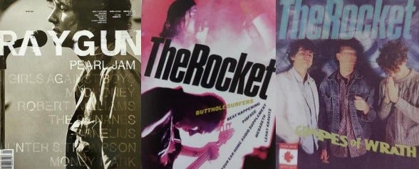
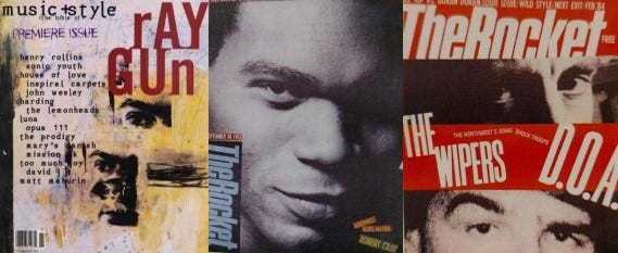
Hand-drawn fonts continue the idea of anti-technology, due to a lack of sophistication of structure and continuity. It mimics the stylistic presentation of a collage personal journal, and the lack of technologized text reflect the idea of being pure, which was also important to Sub Pop as previously discussed. Ray Gun`s logo/title itself frequently changed in its typeface and layout, as seen in the exemplified covers down below. This made the design look rebellious, capturing the DIY punk style. Similarly, identified in Art Chantry’s design and his work in The Rocket. Most notably, using the excuse of hiding acne scars of blues musician Robert Clay, as an excuse for placing the logo vertically and low (Lasky, 2011. p.71). [Yes, you read that correctly!] Which reduces the consistent brand identity, allowing it to contain the punk and DIY energy. The Rocket was first issued in 1979, with Bruce Pavitt regularly writing a column for the newspaper, before he and Jonathan Poneman established Sub Pop in 1986. Along Chantry, Rocket alumni include Lynda Barry; cartoonist/TV impresario Matt Groening, creator of The Simpsons’’ (Henderson, 2021,p.36). [Pretty cool, huh?!]
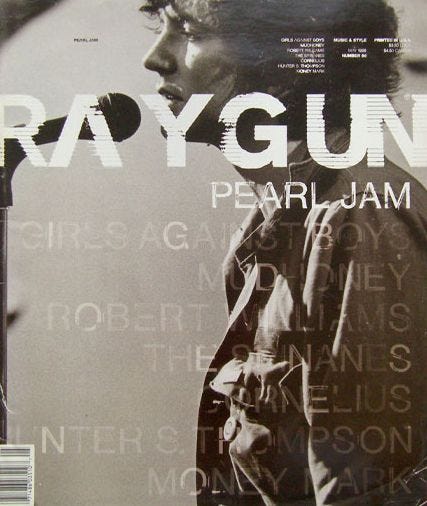
Chris Ashworth. Ray Gun Issue 56, May ,1998. (Ashworth, 2017).
Chantry’s cover for The Rocket in May 1991. Photography by Pat Blashill. (Lasky, 2001.p.71).
Cover for The Rocket in February 1984 by Art Chantry. Photography by Kevin Westenberg (Lasky, 2001.p.71).
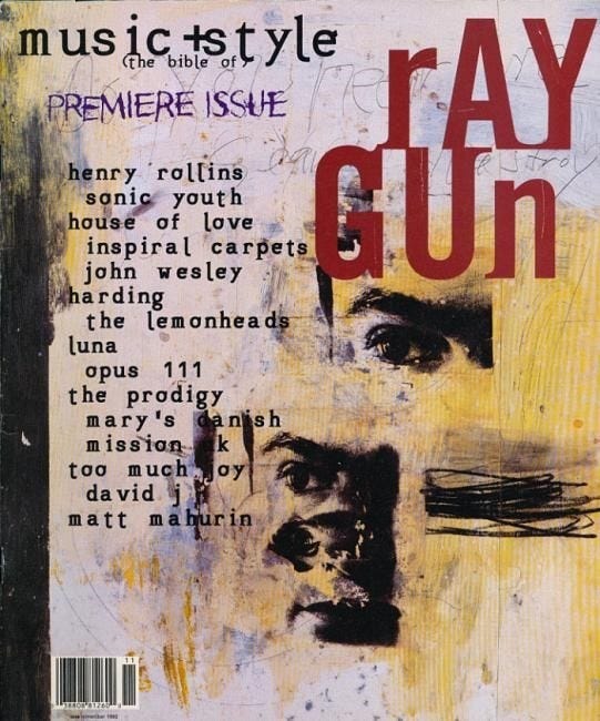
Chris Ashworth. Ray Gun Issue 6, May ,1998. (Dazed, 2019).
The Rocket issue from September 1984 by Art Chantry. Photographer: Rex Rystedt. (Lasky, 2001.pp.68).
Chantry’s first cover for The Rocket in February 1984. Photography by Rex Rystedt and Cam Garrett. (Lasky, 2001.p.68).
Carson was devoted to tearing, slicing, and reconstructing letters for his design, enhancing the DIY-punk aesthetic to his work, in theory constructing designs that could not be functional due to the diminished clarity of texts. Something that would not be widely used in 80s mainstream design. With this his designs can be viewed as a protest not only against design conventions but the 1980s decade. Ray Gun`s aesthetic is closely related to hardcore punk. This aspect showcases where graphic design can be seen beyond advertisement terms. The American Institute of Graphic Arts argues that graphic design is a ‘‘cultural force’’(Barnard, 2013,p.167). In such, highlighting, the argument of graphic design being equally as culturally important and expressive as fine art. Even if critics blast grunge design, it is a cultural force which became mainstream and indicates a change in American society. It is a reflection of the 90s and the emotional condition of society. It is the product that not only the American consumer wanted, but consumers around the world and still do till this day.
Ray Gun`s issue 6, in an anti-consumerist presentation displayed Henry Rollins who had become an underground authority in the 80s and hardcore punk movement through his band Black Flag. Rollins alongside bands such as Minor Threat and Dead Kennedys had protested against manipulation of the 1980s media`s consumerism [this will be discussed in future posts]. The musicians had protested against high class, which with the prominence of grunge in the mainstream revealed its decade long victory. This is because grunge popularised successfully in the mainstream the working-class aesthetic and ideas. The high class now dressed like the working class.
Anti-consumerism is an aesthetic in grunge design which protests against the negative consequences of capitalism and globalisation. This is enhanced through the heavy layered, textured visuals. As well as the off-centred position of the subject from the spread. The charcoal style drawing of Henry Rollins and the subdued tone of red and yellow/orange, lack cleanliness and minimalism. Orange significantly, is a ‘’colour that celebrates the working class’’ (Bellantoni, 2013. p.112), partly by orange being associated with the orange working uniform.
The functions of metalinguistics and phatic functions are strongly used in such example, as the yellow/orange is intensified on Henry Rollin`s face, guiding the spectator’s attention, whilst reflecting his punk, working class background. Without the use of such colour, the subject's face blends with the background of the cover and suggests of no immediate importance. The caricature and the dissected face of Henry Rollins, who had become an underground authority and culture figure, like Sub Pop`s Bleach (1989) cover, does not rely on the artist's face as the selling point or main attraction, as he is almost unrecognisable. It does not indicate a need to recognize the subject. Similarly, as Art Chantry`s exemplified designs for The Rocket. In regard to grunge graphic design and Carson, whilst some criticise the lack of political activism, its stylistic approach is reflective of the grunge mentality and protest against high class culture, which itself is political. Therefore, Ray Gun and grunge designs are important indicators of change in American society, reflective of the activism against globalisation and the consequences of capitalism, which bands like Pearl Jam had advertised [more of this will be explained in future posts].
The charcoal style illustration lacks the feel of technological sophistication
[which makes it looks way more cool], in such carrying an aspect of neo-luddism and opposing ‘’ technology that was materialistic or destructive of community’’ (Kiberd, 2015). Grunge designers, such as Carson are not confronting the expectations of the 80s, especially, the self-centred, pleasure-seeking consumerist mentality that Ronald Reagan's presidency advertised. An aspect that has been undermined in the 80`s Reagan era is the fact that society was ‘’told it was all O.K., that we could spend and consume with no price tag attached’’(Heller and Vienne, 2003, p.3). Reflective of the colourful designs and popularity of Neo-Noir and futuristic style in the 80s. All exemplified designs use dirty, subdued and dull colours. The constant grey tones, as C.W. Leadbeater notes are to be ‘’associated with depression and fear’’ (Birren, 1950. p.43). Ultimately, suggesting that such designs are reflective of themes of solitary, pessimism, and nihilism.
Chris Ashworth’s design for Ray Gun, features photography from Seattle photographer Charles Peterson of Eddie Vedder (Pearl Jam). The ’zero eye contact’ photography and the ‘‘nature of the image made it a fairly alternative non-commercial cover choice’’ (Ashworth, 2017). The non-commercial cover choice results in the cover shot becoming more fragile and private, a visual metaphor of self-reflection. Due to suggesting that the spectator is watching the performer from the side of the stage, in an intimate-even exclusive setting, without the knowledge of the subject, bringing a sense of exclusivity towards the content. The rough, unfinished texture and layers of the text on the photograph resonate a journal style aesthetic, bringing association of privacy, intimacy, and authenticity. Something that the musician on the front cover and the Seattle scene valued. The idea of a non-commercial cover was also followed by the previously discussed Bleach (1989), which was captured by Charles Peterson also. The same idea was used in the Seattle fanzine The Rocket, which Seattle graphic designer Art Chantry had designed for. Art Chantry’s Cover for The Rocket features photography by Pat Blashill of The Butthole Surfers.
Check out our interview with Pat Blashill talking about grunge, punk and photography down below:
Back to Ray Gun`s cover of Eddie Vedder, the non-commercial cover choice is important when considering that Pearl Jam were always reluctant to do interviews or other important strategies for publicity purposes. As Chris Cornell explained previously, after the popularity of their song ‘’Jeremy’’ (1991) and its music video, the band had refused to make promotional videos afterwards. Both exemplified magazine covers indicate that for grunge design, the idea and aesthetic of non-conformity and non-commercialism is important. Considering the left-wing politics of grunge, such design is catering for such mentality and not only reflecting it but advertising it. This means that the continuous aesthetic choices which advertise grunge mentality remark how politicised grunge design is. However, it can be said that the featuring of celebrities on Ray Gun covers, highlight, how grunge had combined consumerism in their contrasting values. This contrast is the critical point for criticism.
Sub Pop had combined consumerism with anti-commercial choices. When in 1993, Nirvana gained world-wide recognition and mainstream recognition in the United States, capitalism became characteristic with the scene. Chantry worked with clothing company Urban Outfitters and Rhino Records. In 1985 Rhino Records had a distribution agreement with Capitol Records; in 1992 they signed a distribution deal with Atlantic Records, and in 1998 Time Warner bought Rhino record company fully, becoming a major company. His work with both companies indicate that Chantry did not oppose capitalism, as he himself was a part of it. However, the aesthetic and the messages in the designs that were created for both companies capitalise and capture the anti-capitalist mentality. This is a theme and trend across grunge, especially, through the music scene which ‘’swore up and down that they didn't want to be famous''(INXS Publications, 2005, p.209). Yet, bands like Pearl Jam continue to tour globally on major venues and have increased their ticket prices. Therefore, this is indicative of grunge protesting against republicanism and their way of consumerism, and the negative consequences of capitalism, instead of capitalism itself. It is more of a protest against high class culture and art, which is not inclusive.
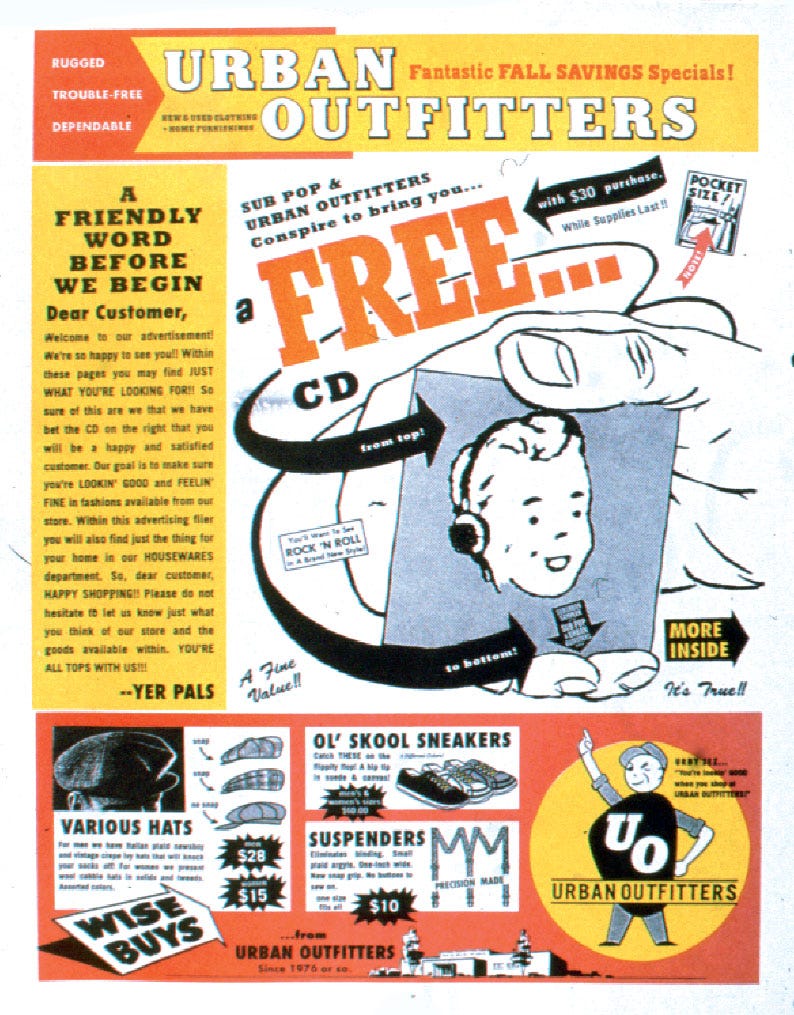
One of the most significant designs of Chantry is his work with Urban Outfitters. The clothing brand capitalised on the vintage, thrift shop aesthetic which grunge had popularised in the mainstream in the 1990s. This recycling culture aesthetic was strengthened to the brand identity of the collaboration with Art Chantry. Art Chantry had designed a Sub Pop collaboration with Urban Outfitters in which a free CD was acquired by any customer with a 30-dollar purchase.
Urban Outfitters and Sub Pop collaboration designed by Chantry (Strizver, 2015).
He had designed the Urban Outfitters logo which mimic’s a logo from a 1950s newspaper advert. However, such collaboration between Sub Pop and Urban Outfitters demonstrates how DIY had become a appropriated by mainstream. This collaboration used the tool style design, which is Chantry`s trademark, as previous designs discussed. ‘’The campaign worked so efficiently in stamping the brand in the consumer's mind that Urban Outfitters retained it as their corporate brand for several years. Paradoxically, Chantry had to stop using his industrial tool style because after this publish splash, ’everybody started aping it’’ (Heller and Ilic, 2009,p.26). Remarking, how such strategy, design, aesthetic and attitude had become profitable, and capitalised on after the grunge explosion, when considering that non-Seattle local Urban Outfitters originated from Philadelphia, Pennsylvania in 1970. Mike Stein founder of Chuckie Boy record label explains about how influential Chantry is:
‘’I see Art Chantry`s influence every day when I go into downtown Seattle and notice some hipster with his arm covered with tattoo ink wearing a gas station shirt…The same is true of his approach to typography and jumble of imagery; it’s so thoroughly percolated into mainstream culture here, it’s almost like the air and light- and like the air and light, it is taken for granted’’ (Lasky, 2001,p.93).
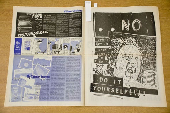
Not only the typography of jumble imagery had become mainstream, but the messages and themes in Chantry’s designs. Chantry created punk inspired designs for Urban Outfitters product promotional magazine Slant in 1994. Notably, encouraging the viewer to support the DIY mentality with the text
‘’No, don’t buy it, don’t listen to them! Don’t be a fool! Do it yourself!‘’.
Artwork by Art Chantry for Urban Outfitters Slant (1994), (Chantry, 2014).
Such statements contradict the DIY mentality and the punk ideology itself, as Chantry is promoting a clothing brand. This indicates how such approach had become a fashionable statement and how easily appropriated DIY or grunge could be. Art Chantry in his design is promoting on the surface anti-consumerism and anti-capitalism, even when considering the discussed DIY slogan and title. Guiding the customer to not buy the product but to create it. He is promoting Urban Outfitters products, associating the DIY, anti-mainstream punk ideology and aesthetic to the brand identity. Considering the popularity of grunge which promoted such values, the brand is aiming to attract audiences and relevance by attaching Chantry’s name on the designs. His grunge identity is important in the creation of the aesthetic. The heightened importance of the DIY mentality indicates the necessity of a subculture element in Chantry`s work.
Chantry explained that ‘’I find good ideas in subcultures. They fascinate me because they have invented their own language. Graphic design is a visual language‘’ (Marks, 2009,p.47). If Pettibon`s discussed designs are taken as central indicators of the hardcore punk mentality, they reveal strong anti-republicanism and anti-corporatist values. Such movement advertised republicanism and corporatism as negative forces, whilst simultaneously the bands give the impression of being authentic and not self-serving. And the association of such hardcore punk identity to the Urban Outfitters, places the clothing brand in a positive, trustworthy and fashionable portrayal. It is the better option then any 80s mainstream clothing brand. The same can be stated about the grunge movement. Also, this exact hardcore punk mentality and its subculture is important for grunge, as Chantry`s designs constantly place an accent on subculture, which is the case with the poster for Rhino Records which references 1970s punk in London.
‘’No Future’’ poster for Rhino Records by Art Chantry in 1994. (Chantry, n.d.)
Chantry designed for Rhino Records in 1994 - a subsidiary of Timer Warner, who had acquired the other 50% in 1998. Notably, his design for the record label uses Sid Vicious from Sex Pistols- again promoting the punk DIY mentality, placing the record label in a fashionable and trustworthy manner. Using Sid Vicious from the English punk band Sex Pistols, further enhances the music labels trustworthy and authentic credibility. They are positioned and crafted as a DIY label despite their major label connection. In such, tricking the consumer into believing that the music sold by the label has the same values, essence and aura of independent music. Such design is aiming to hide the negative aspects of corporatism and capitalism which grunge acknowledged. This is achieved by using Sid Vicious who is a symbol of anti-establishment and even anarchy. Considering the use of Sid Vicious who is a cult figure in punk, such design is a political statement. Whilst Rhino is using the anti-corporative design to promote their brand, for grunge design and the scene, it is once again a protest against 1980s corporatism and conservatism which President Ronald Reagan symbolised:
‘’Corporatism allowed President Ronald Reagan's first secretary of the interior, James Watt, to virtually give away the nation's coal and oil supply to expand uranium mining rights, to violate national park lands and wildlife preserves. The assumption is that corporate profitability is more important than clean air and water’’ (Wylie, 1989,p.37).
Such design is infiltrating and advertising protest against republican politics in a mainstream format. Also, the mentioned collaboration indicates how Art Chantry had become important within the American music scene in the 1990s, as record labels besides Sub Pop, who had not signed Seattle artists desired his designs. Whilst Stephen J. Eskilson focuses on David Carson and suggests him as the central figure of grunge design, Art Chantry`s work subverts such assumptions. Art Chantry is more representative of the grunge movement and the grunge design, when considering his origins with the Sub Pop label and his geolocation of Seattle. By promoting recycling culture which is important for grunge as a symbol of protest and remarks a heightened awareness of earth preservation, it is politically driven.
The designs are politically driven in a mainstream format. As the exemplified designs of Chantry`s work in The Rocket reveal, Chantry built the grunge aesthetic with his messages and designs. Indicating a change of values in American society (particularly the victory of the working-class aesthetic and left-wing politics); Sub Pop with Chantry had created an aesthetic of the Seattle’s scene which till this day is known around the world.
The next entry will discuss his most controversial and popular designs for
Give Peace A Dance, which are nothing but politics.
Reading daily exercises the brain, improves sleep and reduces stress, so why not read some more?! Check this out:
The Influence of Blue Note Records on Art Chantry
The integration of the jazz aesthetic in Art Chantry`s work carry`s the protest essence, same as the previously discussed comic illustrative style or Dadaism. Chantry`s designs reflect the Blue Note Records albums and design of Reid Miles. As previously discussed, most grunge musicians and Chantry had supported Democratic politics for the most part. Pe…


