The Influence of Blue Note Records on Art Chantry
What`s the connection between Louder Than Love (1989), Sidney Bechet (1968), Lee Morgan (1956), Fire & Ice (1980), Bill Clinton and Presidents of the United States (1995)?
The integration of the jazz aesthetic in Art Chantry`s work carry`s the protest essence, same as the previously discussed comic illustrative style or Dadaism. Chantry`s designs reflect the Blue Note Records albums and design of Reid Miles.
As previously discussed, most grunge musicians and Chantry had supported Democratic politics for the most part. Pearl Jam had supported Bill Clinton and famously got invited to the White House ( in case you missed it, click here). Not only did the former President show support for grunge musicians but he famously admired jazz. This is evident in the 1990s with President Bill Clinton as he had spoken at the 14th anniversary Newport Jazz Festival in 1993. The President himself played the saxophone and closed the evening with the statement: ‘’jazz is a true reflection of the American people. A music of inclusion, a music of democracy, a music that embraces tradition and the freedom to innovate’’ (Weekly Compilation of Presidential Documents, 1993,p.1118). Not only did Clinton value jazz, especially its democratic values, but he identified how political it was and how reflective it was of the 1990s Democratic Party.
Considering Pearl Jam`s support of Bill Clinton- grunge likewise expresses the same like towards jazz. Nirvana’s Kurt Cobain has identified that one of his influences include an important blues musician of the 1930s, Lead Belly (Huddie William Ledbetter). Nirvana’s famous MTV Unplugged (1994) performance featured the band covering Lead Belly’s song ‘’Where Did You Sleep Last Night’’ (1944), a signature cover song of Lead Belly. Cobain invited Mark Lanegan (The Screaming Trees) to take part on the MTV performance. Before the MTV unplugged performance, Mark Lanegan worked with Kurt Cobain, Krist Novoselic and Mark Pickerel (Nirvana, The Screaming Trees) on a Lead Belly project, recording a full record of Lead Belly covers. Which resulted later in Lanegan’s solo album The Winding Sheet (1990) (Lanegan, 2020, pp.49, 166). This album featured Lanegan performing ‘’Where Did You Sleep Last Night’’ (1990) and the album featured vocals from Kurt Cobain.
Pearl Jam`s song ‘’Yellow Ledbetter’’ (1992) also has been speculated as a homage to Huddie William Ledbetter (Lead Belly). Not only is Lead Belly referenced in the Seattle scene but also in bands that are closely associated with the grunge sound despite them not originating from Seattle. For example, San Diego, Californian band Stone Temple Pilots mention Lead Belly in their song ‘’Trippin’ On A Hole In a Paper Heart’’ (1996). Also worth mentioning that Mike McCready (Pearl Jam) joined the Seattle jazz band Tuatara featuring members of R.E.M and the Screaming Trees. Therefore, it is important to acknowledge the influence of jazz and blues, and Blue Note Records on grunge, but not only on music. This blog entry focuses on design and aesthetic, specifically on Art Chantry.
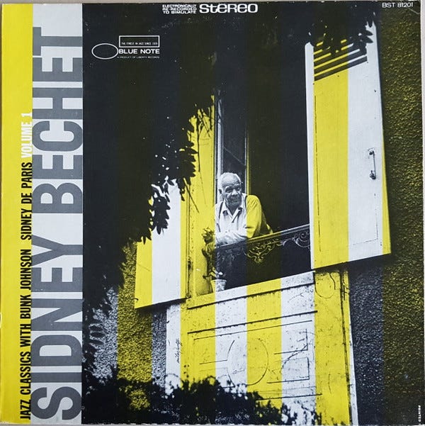
Sidney Bechet - Jazz Classic With Bunk Johnson Sidney De Paris - Volume 1, 1968. Released on Blue Note Records (Discogs, n.d.).
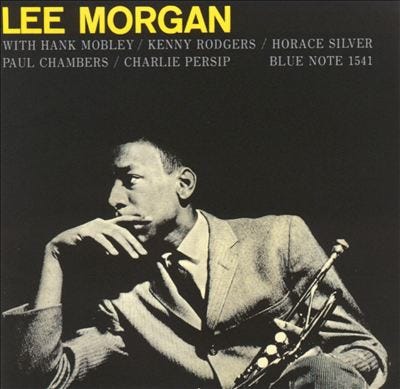
Lee Morgan – Lee Morgan Sextet, 1956. Released on Blue Note Records (Dereksmusicblog.com, 2020).
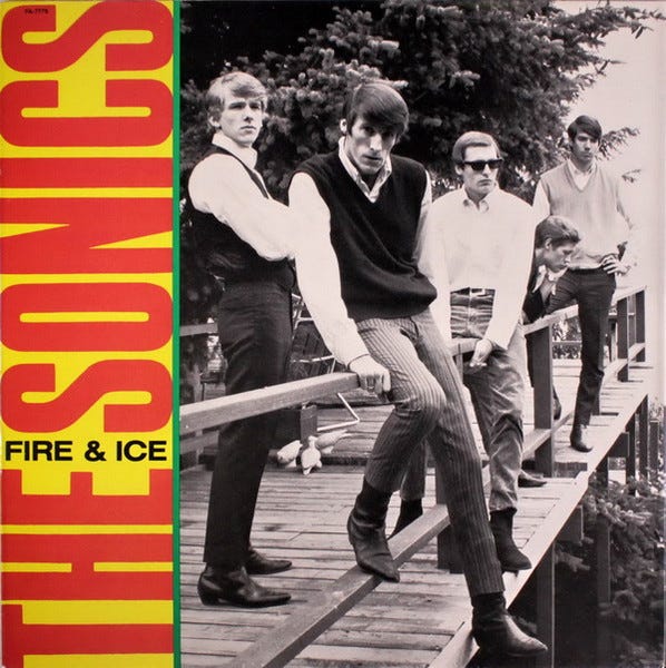
The Sonics- Fire & Ice (1980), cover by Art Chantry (Discogs, n.d.)
CD/LP for Soundgarden’s major label debut Louder Than Love (1989) on A&M Records, after them leaving SST Records. Photograph by Charles Peterson and designed by Art Chantry (Discogs, n.d.).
Eduardo De La Fuente and Peter Murphy explain that capitalism is cyclical and rotates from interesting to boring; fakery is used to compensate for the lack of inventiveness; capitalisms goal is to reinvent itself; (Fuente and Murphy, 2014,pp.2-3) but it is a ‘’quantum phenomenon. It works well when it is not itself’’ (Fuente and Murphy, 2014,p.5). Lack of inventiveness and the desire for reinvention is central for this discussion, as blues and jazz are great influences for grunge and grunge design. In regard to design, Blue Note Records and the exemplified Chantry`s album covers share similar colour schemes, composition and typography, album design ideas. It is the colour scheme which is important for grunge design and can be found in Blue Note albums.
Chantry`s design for Soundgarden Louder than Love (1989) shows links to Blue Note Records aesthetic, especially when considering its colour scheme. Chantry’s cover uses black and white photography with yellow tones. The same can be seen in the example of Lee Morgan and Sidney Bechet albums. Chantry uses the same colour palette in The Sonics Fire & Ice (1980). The exemplified Blue Note albums are also similar to the colour scheme in Ray Gun magazine; the examples mentioned previously [ CLICK HERE :) ]. For example, Sidney Bechet`s album features a washed out yellow, black and white design. The colours don't appear highly saturated which has been a method used in Ray Gun magazine in crafting the grunge aesthetic.
The lines of yellow centralise Sidney Bechet in the portrait photo, making the spectator focus on him, as the yellow bars mimic a prison cell. The design relies on Sidney Bechet`s cult status heavily, as the American musician received great acclaim in the 1940s and was known as the grand master of the soprano saxophone and clarinet. Similarly, Lee Morgan is centralised on his album with the same goal. Both jazz examples can be identified in Louder Than Love (1989) as the photo by Charles Peterson of Chris Cornell is centralised in Chantry`s design.
The work of Peterson features rich black and white photos, not only cheaper to produce and develop but easier to use with flash. It creates a sense of authenticity by using the: ‘’stark, grainy, black and white imagery traditionally associated with documentary images and photojournalism’’ (Wells, 1996,p.176). This is because it lacks editorial involvement and promotes the DIY mentality, especially when considering that monochrome photography was largely available compared to full colour. And simply, allowing to create a sense of the real scene, the atmosphere, dynamic of being in the crowd of a Soundgarden show. A sense of photojournalism and documentary.
Charles Peterson also rebels against the photography standard and rules, as he explained that ‘’I don’t look at the viewfinder at all- which I think takes some of the edge off that digital 'perfection' that everyone seems to be seeking with more sharper megapixels’’ (Croitoru, n.d.). The light trails, lack of stabilisation, low-shutter speed creates anti-commercial photography. The idea of anti-commercial photography (avoiding commercial photography standards) is important in Chantry`s work, as the choice to hide Cornell`s face on the album rebels against traditional consumerism.
By copying and imitating Blue Note Record designs, he is introducing a protest element as he is assimilating jazz which has a history of criticism in American culture. At the same time, as Chantry`s design does not show Cornell's face, Louder Than Love prioritises the live show aspect which was important for Sub Pop as a brand. All exemplified examples indicate the importance of crafting a cult star. It is not only the media crafting idols, but Chantry as a graphic designer is doing this in order to generate sales. Despite his anti-capitalist attitude, he is capitalising on the musician as the selling point. Louder Than Love by Soundgarden was released in 1989 on A&M Records, after the band left SST records. Making it their first debut on a major record label. Furthermore, indicating how important the cult star is for the exemplified album, as a major record company is producing it, with the intent to market it to mainstream audiences. Just like Sub Pop had highlighted the importance of the live show and DIY aesthetic, A&M Records with Chantry are reproducing the same designs.
The fact that A&M are reproducing Chantry`s grunge style remarks how fashionable and important his designs were. Chantry protesting against Republicans and advertising grunge values (which was addressed in previous posts, click here) whilst A&M had reproduced such design on a major scale, places him as one of the most important designers in grunge and 1990s United States. As Fuente and Murphy noted, Capitalism's goal is to reinvent itself and Sub Pop or A&M with Chantry are reinventing Blue Note albums in order to capitalise.
Such adaptation is also seen in the composition. Louder Than Love (1989) has the album title positioned on the left side of the design. Popular design choice across Blue Note Records, as exemplified in Sidney Bechet`s album. If Fuente and Murphy`s observation is considered, grunge lacks inventiveness. The lack of inventiveness naturally foreshadows capitalist values and the democratic values of jazz. Walter Benjamin (see Origins Of Grunge Design : Art Chantry Pt. I) before established that all art is political with the involvement of mechanical reproduction, therefore, even if the Louder than Love (1989) album does not feature blunt political messages such as the discussed example of The Thrown Ups album, it is political as it represents capitalism. Whilst, Louder Than Love (1989) is representing the alternative public, it is catering for an underground portion of the society and assimilating jazz values to it, simultaneously being published on a mainstream label.
Even if it had become exploited in the 1990s mainstream, it initially and continuously had the idea of anti-consumerism. Due to 1980s Republicans such as Ronald Reagan promoting the wealthy lifestyle and consumerism as achievements and one`s primary significator of success, whilst marginalising the lower classes. The designs aim to be as anti-commercial as possible, even by copying jazz designs. Jazz had never been a mainstream product and considering 80s popularity of electronic dance music and new wave, re-production of jazz would not attract mainstream audiences. In fact, it would resurface and bring attention to racial injustices that jazz expressed to the public by such reference.
Jazz combines European classical music with African, slave folk music, consisting of great West African influence. It is a music genre and culture relying on improvisation which came to prominence in the 1920s. But when considering American white traditionalists and conservative Christians, such music is controversial as it reflects West African culture, racial injustice, and miscegenation. It is a form of protest against American white conservatives which at the time of 1920s jazz golden age supported racial segregation and white supremacy. Chantry explained that jazz had ‘’all the same subtext that punk rock did, except it was jazz. They were all junkies’’ (KEXP, 2018).Chantry suggests that jazz ideologically is similar to punk and for the study of grunge jazz should be acknowledged.
Moreover, Chantry explained about Blue Note graphic style that ‘’all the standards are the same and you look at that stuff and they're done quickly, they were done low budget and they look absolutely gorgeous. I wanted to do that for Sub Pop. What I was trying to nail down was a look that was distinct, that was clean, that was incredibly bold and forceful’’(KEXP, 2018). Besides the stylistic elements, the connection between jazz and grunge is in democracy. Grunge had agitated for democracy and jazz is reflective of democracy and the American people. Historian David Blight expressed that the link between jazz, democracy and the constitution ‘’can be found more abstractly, in that they provide a ‘’place where people reinvent themselves’’ (Whyton and Gebhardt, 2015,p.241). Even musical improvisation in jazz is a form of rebellion against traditions. By grunge assimilating design wise and musically to jazz, it is resurfacing issues such as inequality faced and vocalised by jazz. The political nature of jazz is adapted in grunge. Contrasting 80`s mainstream public which was focused on one`s singular success and pleasures. Therefore, grunge design is a form of rebellion supporting Democrat politics against 80s Republicanism in a capitalist format.
Art Chantry`s design for Presidents of the United States self-titled album (1995). Photography by Lance Mercier (Discogs, n.d.).
This idea can be exemplified in Art Chantry`s design for the self-titled album of Seattle band Presidents of The United States of America (1995). The idea of anti-consumerism and DIY aesthetic is achieved by the off-centred print on the CD itself, not fitting the CD standard as such mimics a reproduction/printing fault. The CD features a design which mimics an inspection stamp specifically by the U.S department of Agriculture. But the off-centred design suggests that the ‘inspection’ was not done carefully as the off-centre manner connotes a rushed work and mass reproduction. However, the design stamp of the U.S Department of Agriculture inspection infers that the U.S. government has approved and supports this material-ultimately Seattle scene. It connotes a handmade product, mimicking a DIY design.
With the lack of photography of the band, such design just like previous Art Chantry`s designs appears anti-commercial. Whilst the band`s name itself is politicised; the album's design features the band members with the President of the United States Bill Clinton. Referencing the fact that the band supported and performed at Bill Clinton`s Democratic Party Fundraiser in 1994, Seattle. The band members names and the presidents name are not capitalised putting them all in an equal position. The president is not positioned in front of the band members, the band members are even positioned in front of him. Just like the design of The Thrown Ups (Seven Years Golden (1997) Pt. I : JFK and Cobain), Chantry is not segregating the President of the United States from the musicians, putting them in equal power.
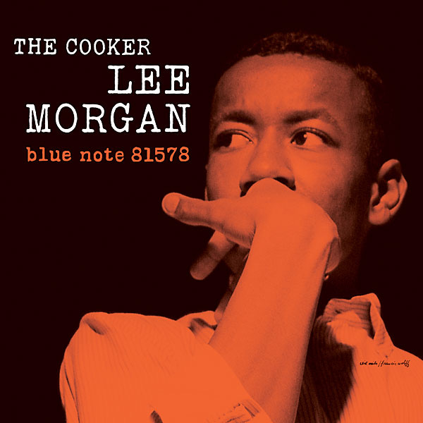
Whilst understanding Chantry`s like towards Democrat politics, which Bill Clinton represents, such design can be perceived as a political tool. Because just like The Thrown Ups design, it is placing Democratic figures in the same power position as musicians, making them appear trustworthy and ordinary. They are crafted to be friendly, especially as the Bill Clinton`s photo with the band suggests. This album uses the font style which has been used frequently in grunge designs and Ray Gun (check out this). Similar to a typewriter style. However, similar style can be found in the Blue Note Records albums, for example Lee Morgan The Cooker (1958).
Lee Morgan- The Cooker (1958). Released on Blue Note Records (Waring, 2021).
Showcasing not only influence design wise on Chantry, but how grunge is similar to jazz in political aspects as both lean towards Democratic politics. Furthermore, showcasing the connection between Art Chantry, Eddie Vedder or The Presidents of the United States and why they had supported democrat Bill Clinton. Democracy is important for grunge. President Bill Clinton formally ‘’recognized jazz as a ‘metaphor for American democracy…democracy, like jazz, is not simply about protecting ‘individual freedoms’; it is also about the demands of the collective or community’’(Ramshaw, 2013,p.117). Whilst grunge aimed to protest against conservatism of Republicans, just like Kennedy, Clinton had addressed and aimed to attract the alternative and youth. Meaning that grunge albums like in the case of The Presidents of the United States with Bill Clinton`s photo were political not purely in the sense of mechanical reproduction.
It is an advertisement of Bill Clinton for the youth audiences. Whilst the band itself does not actively address politics in their lyrics, the aesthetical presentation does, as discussed through the exemplified CD. The designs of Art Chantry politicise the music with his values. However, the Presidents of the United States have covered the political song MC5 ‘’Kick out the Jams’’ (1969) in the album, who have not only inspired grunge or punk of the 80s, but had been inspired by jazz. The lyrics feature:
‘’I've been elected to rock your asses till midnight;
This is my term, and I've jammed out my perm, but it's all right;
I solemnly swear to uphold the Constitution;
Got a rock and roll problem?; Well we got the solution’’(Tomich, Derminer, Smith, Kramer,Davis, 1969)
The first verse compares presidency to rock`n`roll, suggesting that rock musicians are elected by the public and as important as presidents. This same theme can be seen in Chantry`s work when he challenges the social construct of presidents and musicians (check out this or that). The lyrics feature the line ‘’I solemnly swear to uphold the Constitution’’ giving the impression that rock musicians are trustworthy and have the solution. Therefore, such lyrics with the photograph of Bill Clinton, suggests that the band is trustworthy and the candidates, politics or president they support is the right choice. Whilst Walter Benjamin addressed mechanical reproduction, CD as in this example, showcases how design can be one of the most politically saturated arts. As the CD combines political lyrics, design and art and mechanical reproduction.
Art Chantry`s discussed designs all feature a political aspect. Art Chantry had designed and worked for Sub Pop who had popularised and created the aesthetics of the grunge design and music. When considering the political nature of grunge designs, he as the originator of the style which became mainstream in the 1990s, is significant. Benjamin described art to originate from religious ritual purposes, the example of the given CD as a graphic design product showcases that art and graphic design have the same purpose.
David Carson has filed a Supreme Court case in 2022 with the main argument that all graphic design is expressive art and should have the same protection as artists under the First Amendment (Carson, 2022). This means that Carson, as one of the most popular of grunge designers, recognizes that graphic design is art and has importance beyond advertisement. As Origins of Grunge Design Pt. II mentioned Carson had been criticised by not following the approach of political designers, yet his argument and his popularisation of the grunge aesthetic indicates how artistically aware grunge designers are. Whilst the exemplified designs from Ray Gun do not compete with the political display of Chantry, they still exude a protest element. Considering Benjamin`s mechanical reproduction observation, graphic design as a mechanically reproduced art form is the most politically aware, as it is serving capitalism. However, in the case of the CD, the political nature of the music or the political protests of the musicians make such designs even more political. In the context of grunge design and when considering the anti-republican messages in grunge music, such design is serving a political movement.
Reading daily exercises the brain, improves sleep and reduces stress, so why not read some more?! Check this out:
Origins of Grunge Design Pt. III : Give Peace a Dance (1988)
Just as the tool poster used recycled material to form a collage, Give Peace A Dance (1988) series use this same approach to create politicised designs. Art Chantry described that as a graphic designer ‘’we’re quite dangerous in our actions, really. There is great power in our skills’’(Harris, 2019). Chantry`s designs for Give Peace a Dance- a 24-hour d…


